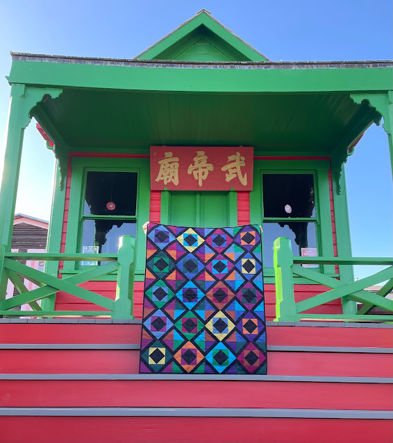
COLOR COMMOTION
Anyone who knows me at all from a quilting perspective knows that my favorite fabric of all time is Oakshott shot cotton.
I have been privileged to correspond fairly frequently with the owner of Oakshott, Michael Oakshott himself, who is extremely generous. He gave me a deep discount when I made an MCC quilt one year using Oakshott, and when I place an order I will often find "surprises" that he has included.
He contacted me earlier in the year about a possible collaboration using a bundle that is slated to be called Jett.
He sent a bundle of 12 colors, with the color threads going one direction, woven with black in the other direction (the warp and weft). One thing I love about Oakshott fabrics is that their dimensions are all larger than the quilting cottons we buy here in the US. For example, we purchase fabric by the yard, which is anywhere from 40" to 44" wide, a fat quarter is about 18" x 22" and a fat eighth is 9" x 11". Oakshott is woven by the meter and is 54" wide. So their fat eighths are a generous 10" x 27" and fat quarters are 19.5" x 27".
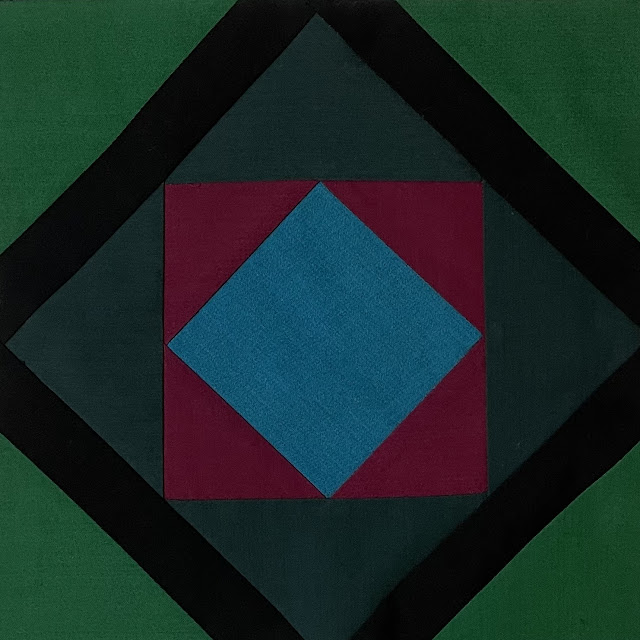
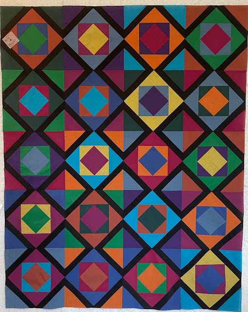
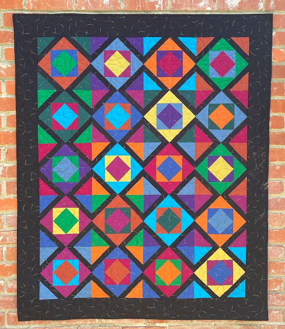
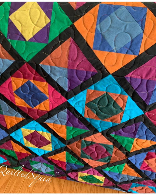
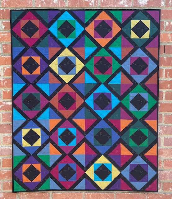
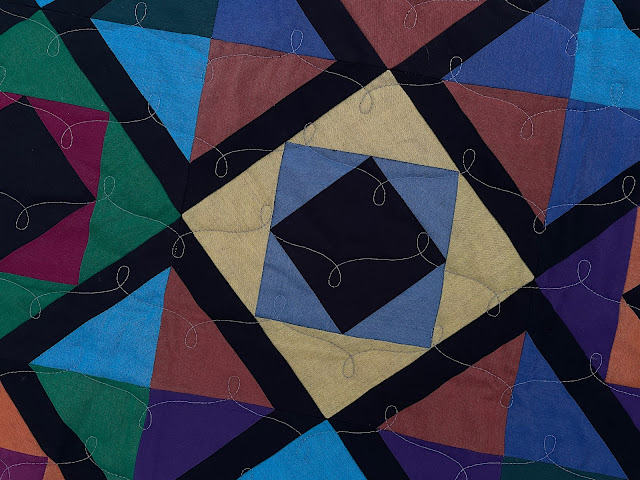
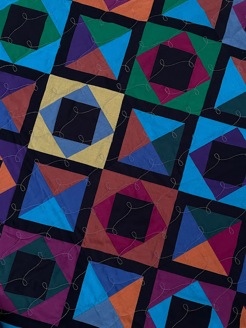
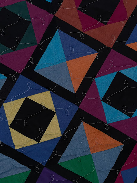
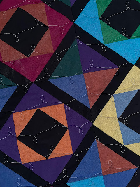
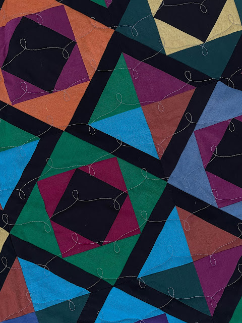
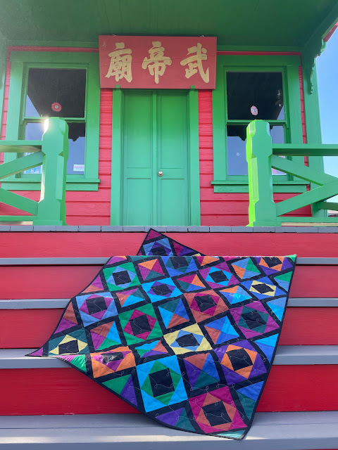
I had decided that my Charm Parade pattern would once again work nicely with these fabrics. Each block would have four different colors, with a consistent "lattice" strip of black to tie everything together.
I made quite a few blocks before I realized that Michael had sent me a generous amount of fabric.Jettstream is a collaboration with Oakshott Fabrics. I rewrote my Charm Parade pattern to specifically use a fat eighth bundle of Oakshott called Jett.
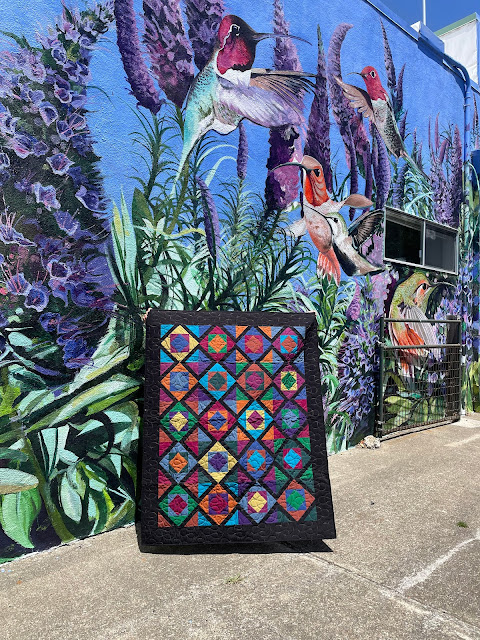
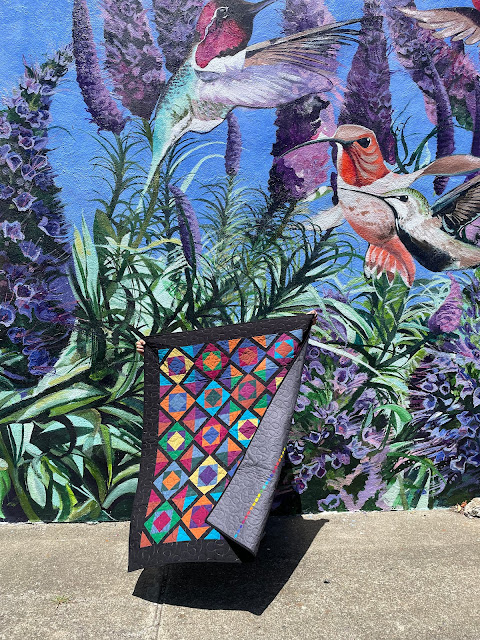
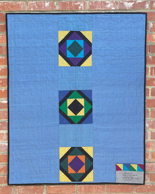
It's "sister quilt," Color Commotion, uses the same fabric, but the center squares are each a different color rather than black. I actually like this version better as I think the black calms everything down a little.I put the extra blocks on the back, including a couple from Color Commotion. Also, notice the cute label.


.JPG)
.jpg)
.JPG)




3 comments:
05 08-

-
-
October 12, 2022 at 7:52 PM

-

-
-
October 13, 2022 at 9:26 PM

-

-
-
October 21, 2022 at 7:42 AM

I love the locations you find to photograph your quilts. And it's really fantastic to see the difference in Color Commotion and Jettstream; the small change of adding a consistent black center square is really striking to see so clearly with the quilts shown here one after the other.
That last photo is perfect! Your quilt is fabulous!
It's really interesting to see these two beautiful quilts next to each other: one with the colorful centers and one with the black centers, and to compare the effects of each. I love the results of your experimenting, but also love the original!
Like the others, I also love the mural and the color buildings of the Mendocino location. You really do life a colorful life!
Post a Comment