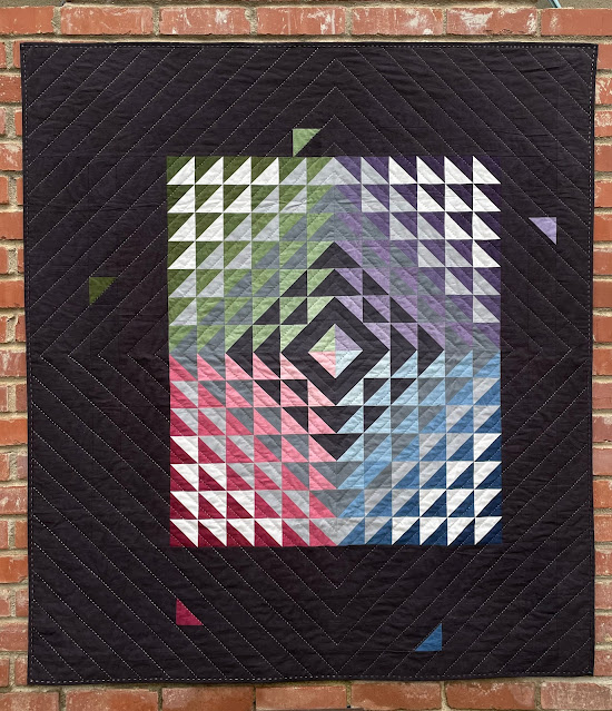
Gradient is one of those quilts that is successful because of the perfect combination of design and fabric. Years ago, I had purchased four eight-step ombre bundles of Cherrywood fabric. If you have not worked with Cherrywood, it is a beautiful hand-dyed cotton fabric with the look of suede, and they are headquartered in Minnesota (so Mark would of course say it has to be great!). Shortly after that, my dear friend Amanda @crazymomquilts designed several quilts for her second line of fabric and this one was perfect for the Cherrywood fabric. In addition to the four colors, I added pale gray to black, pairing the lightest colors with the black and the darkest colors with the pale gray.
It was now a rectangle about 30" x 33". I'm not a huge fan of wall hangings so I knew some kind of border was in order. I decided on an asymmetrical border with a few triangles here and there.
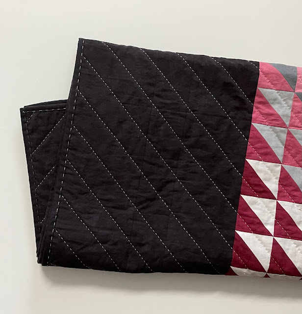
I had originally thought I would hand quilt it with white to black perle cotton. But then I decided to use colors corresponding with each quadrant and do a reverse color order in each quadrant--lightest perle cotton in the darkest colors, moving to darker thread colors in the lightest fabric colors. Honestly, I'm not thrilled with the outcome. The lighest threads look nearly white against the black borders. But it's finished and there is no changing it now.
It wasn't until I was working in the blue quadrant that I realized one of the triangle units was incorrect. The quilt has kind of an Amish feel to it, so we will call this my "humility square."
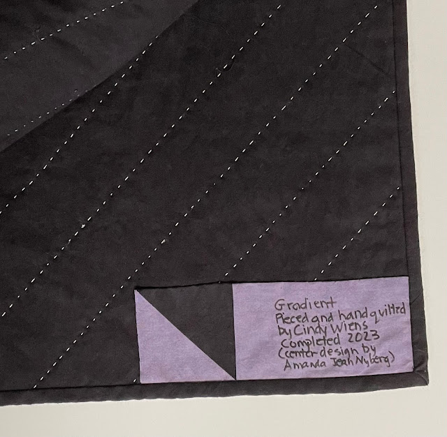
I used big swatches of color for the backing.
This was the first time I did a big stitch on the binding, changing colors to match each quadrant (but it really does look like white, right?)
We photographed it in front of one of my very favorite murals, Amazing Grace.
Quilt name: Gradient
Design by: Cindy Wiens (with center design by Amanda Jean Nyberg)
Made by: Cindy Wiens
Hand quilted by: Cindy Wiens
Size: 51" x 56"

.JPG)


3 comments:
05 08-

-
-
September 18, 2023 at 8:36 AM

-

-
-
September 18, 2023 at 12:28 PM

-

-
-
September 18, 2023 at 2:36 PM

The thread does look white against the black, but based on your first photo I can definitely tell that is not the case! The borders upsized it nicely!
I sure understand how thread colors can read differently on particular fabric colors. It's only of the reasons I unspool a thread color on a quilt before winding bobbins for machine quilting. Several quilts that I thought would look good with beige thread have been quilted with pale green, of all things! Ya just never know about color interactions. But the quilt is beautiful, by my way of thinking. Great fabric color gradients, for sure. I have used Cherrywood (the vendor sold lots at Iowa quilt shows), and saw lots being sold at QuiltCon this year too. Might be seeing some modern quilts made with it, though I'm sticking with my Painter's Palette solids. Happy for you to have another finish! You've been a busy lady. And you have no idea how fortunate you are to have a quilt-holder to help you get such beautiful photos. That "Amazing Grace" mural is wonderful!
So many wonderful value changes going on here. Even the thread colors and even though it looks white. I love how you worked it all out by adding to the size and throwing in the random triangles. I would have never noticed the "mistake" block placement. Isn't it funny how often things like that happen and we don't see them. I think it adds to the charm and human touch.
Post a Comment